WealthFund case study
FINTECH PLATFORM
WealthFund
A Better way to Create Wealth for Individuals
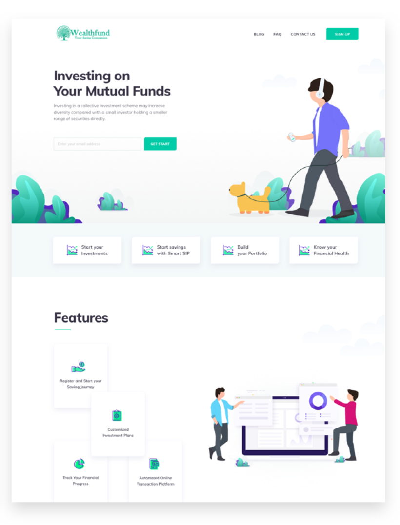
Wealth Fund is an online financial advisory that helps manage your personal finance journey from savings to investments.
Managing Wealthflow
Merging the two to help individuals maintain their financial health
The challenge that we undertook was to seamlessly merge the two functions : a) Managing personal savings b) Grow them by investing in customized investment plans c) Maintain & track the portfolio.
Services
UX Design & Strategy
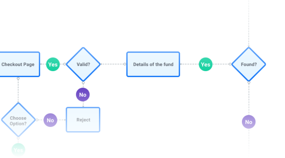
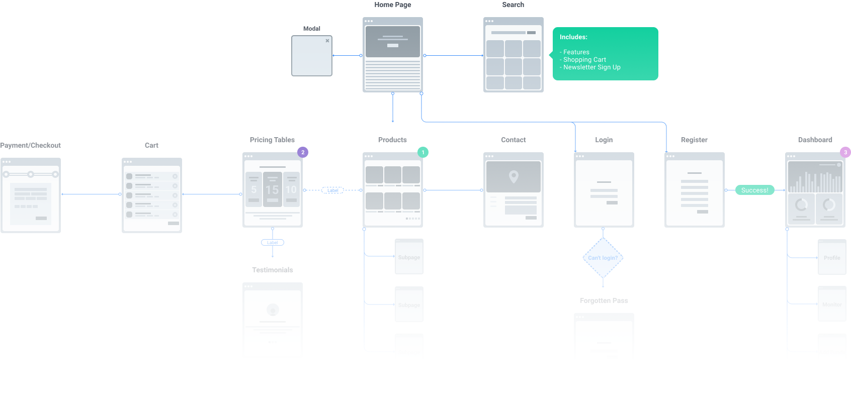
With user research, analysis and understanding the financial motivation of the users, we came up with user journeys, flows and IA that were simple, informative and made the users comfortable with the use of technology for money matters.
UI Design
Being a financial platform, the colors, icons and illustrations were designed for consistency, easy consumption, create interest and at the same time build Wealthfund as a brand.
HTML
<div class="react"></div>
CSS
                          .react{

                          background:linear-gradient

                          119deg,
$grey0%,

                          $dark-grey100%); }
JS
                          var colors =

                          ["#74B087" , "#74B017" , "#000000" ];

                          function react()
UI Development
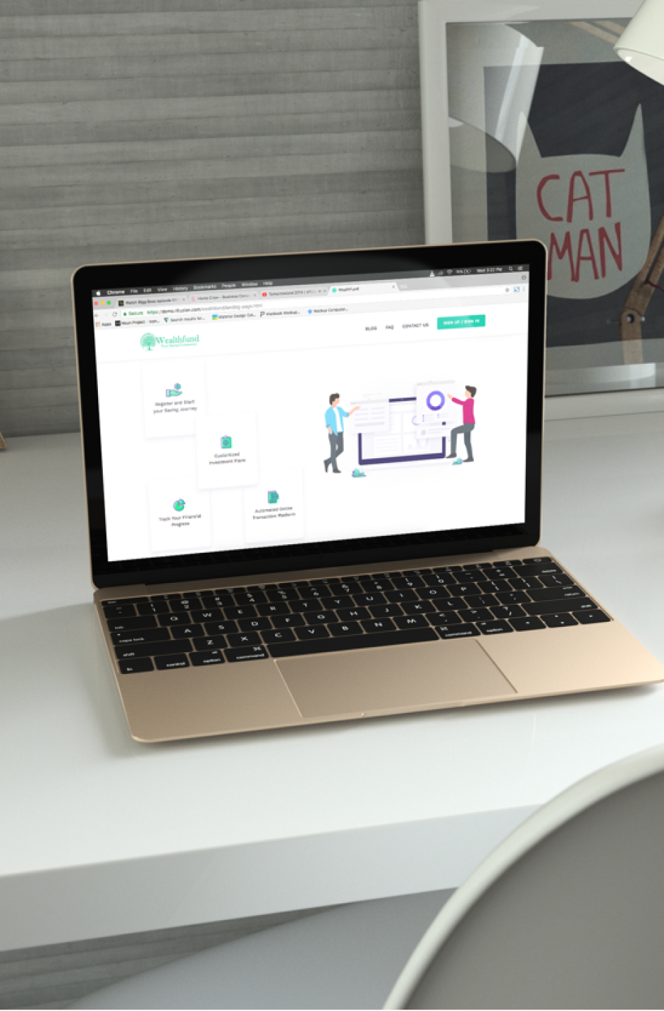
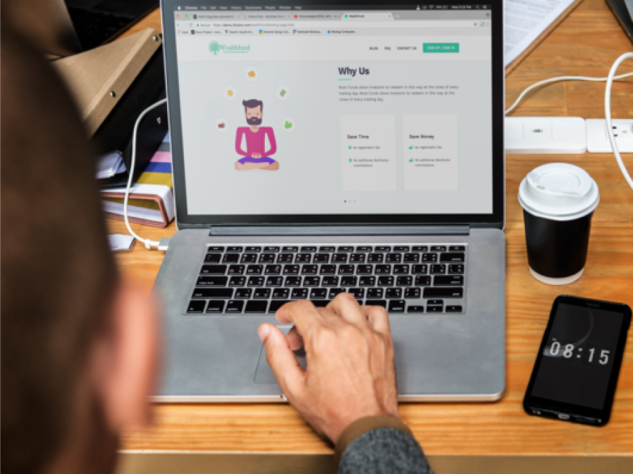
With constant collaboration between the designers and developers , we developed the web-app, mobile responsive version for pixel-perfect, fast & secure functioning.
Research
Laying out the design strategy with UX Research
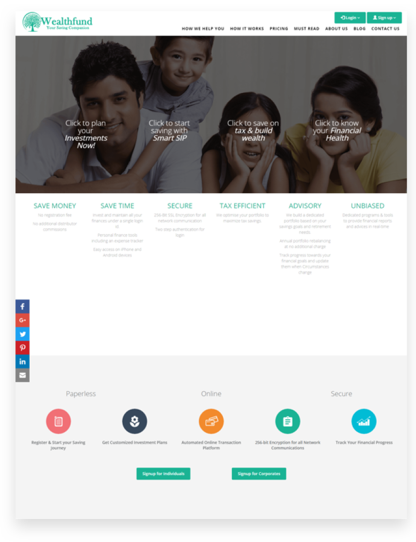
Activities like stakeholder, user interviews & competitor research helped us identify problems and hence strategize on how to build the web, mobile responsive platforms and marketing website.
Solutions
Integrating personal finance & mutual fund.
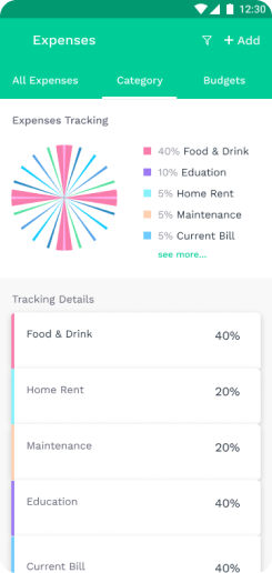
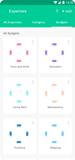
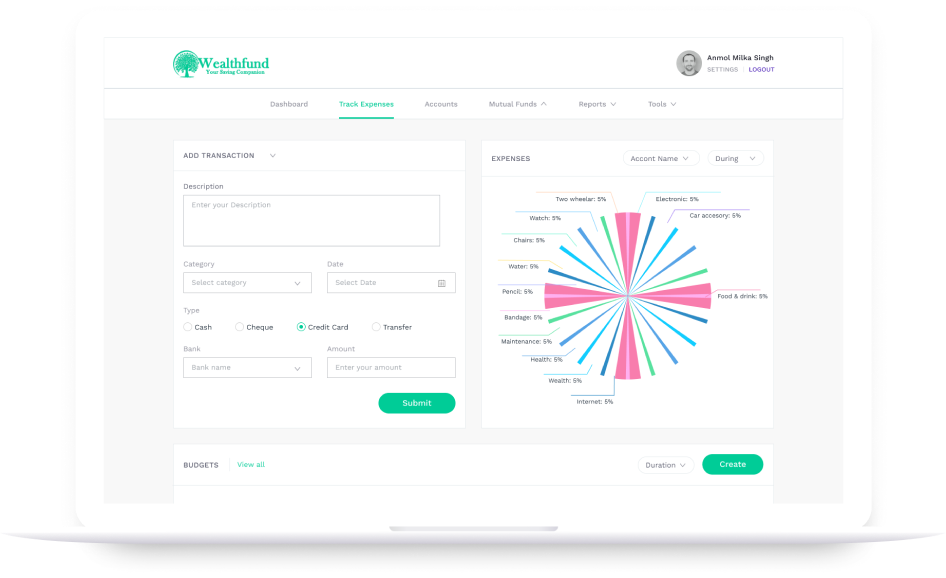
With this as the main goal, we sought to build an interface that helped an individual manage, track his savings & expenses and parallely turn them into smart investments with the platform.
Constant tracking of portfolio performance.
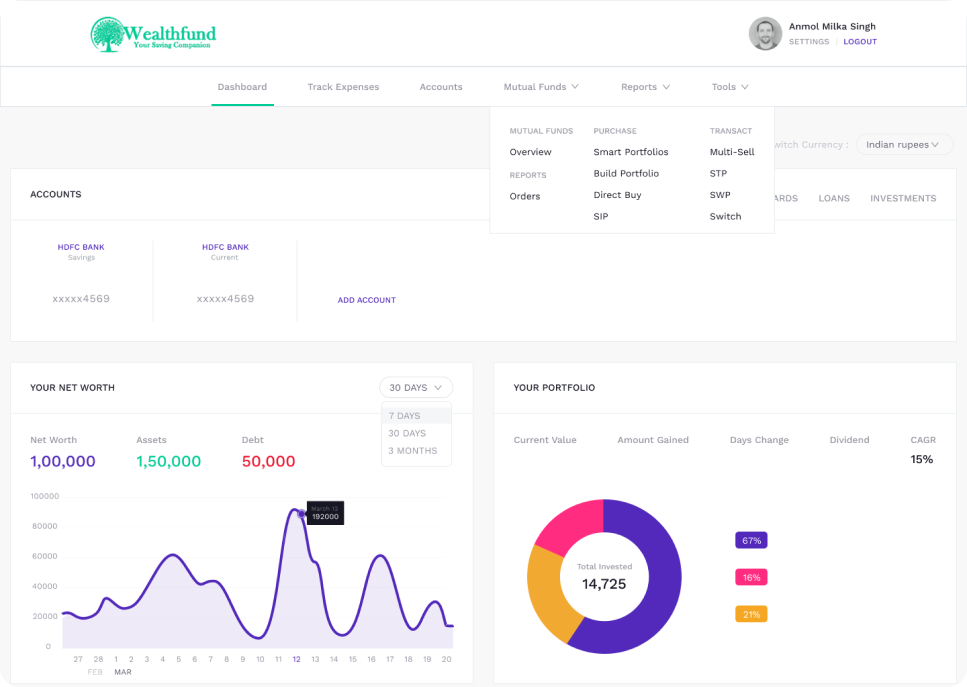
We helped users be up-to-date with their investments by monitoring progress, losses and hence track their financial journey from a single account.
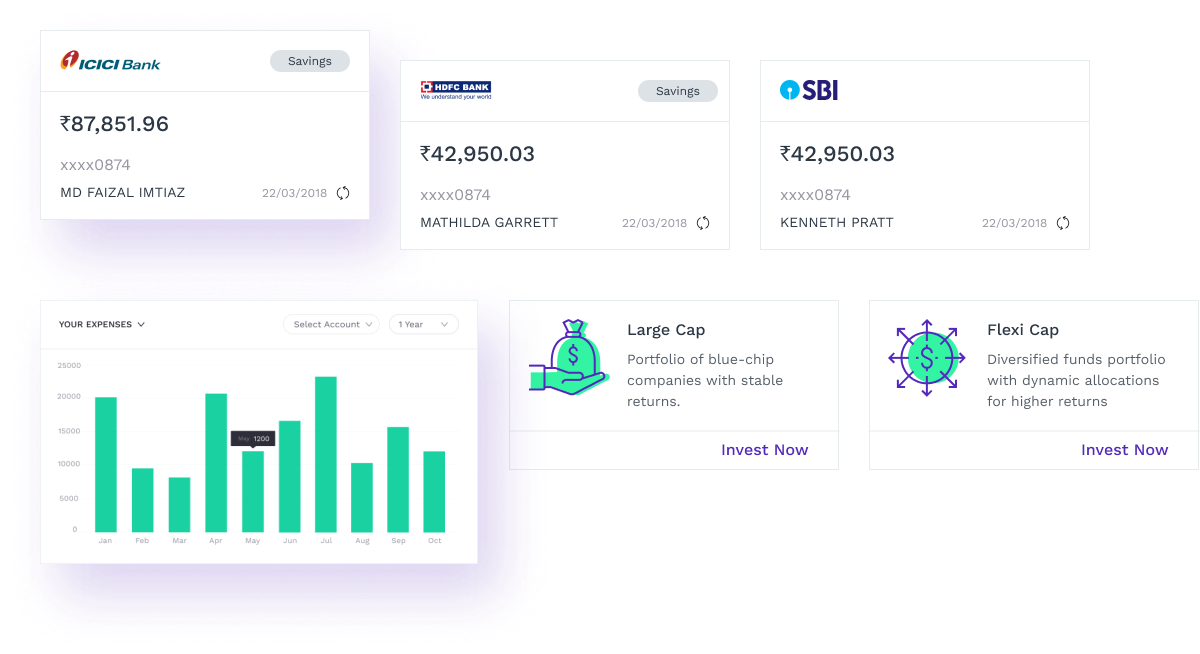
Cards designed for easy, consumable content.
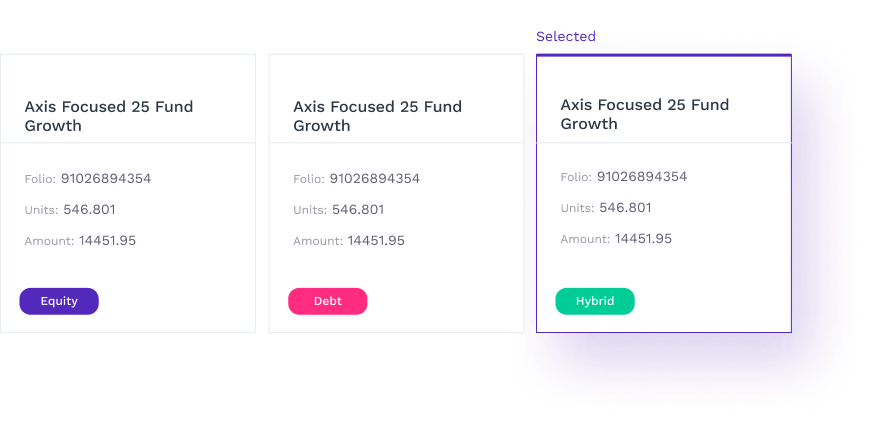
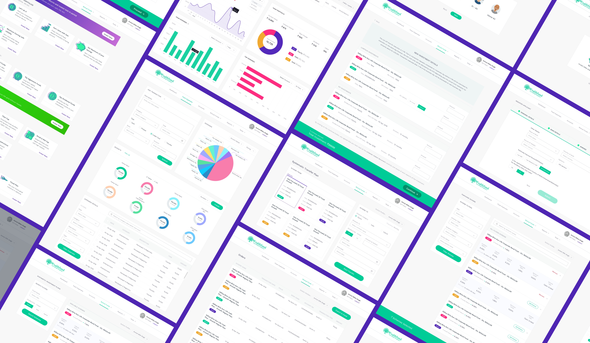
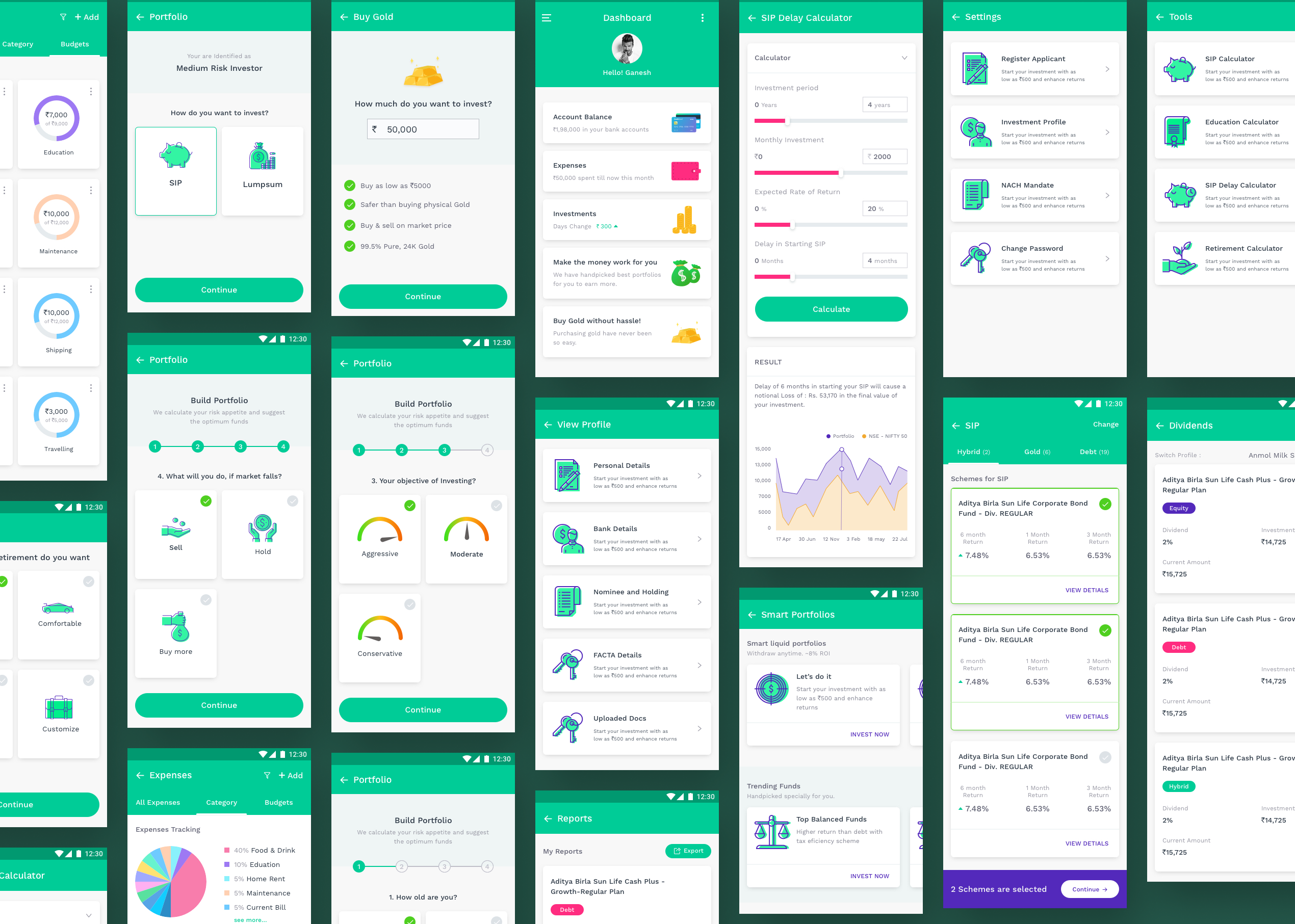
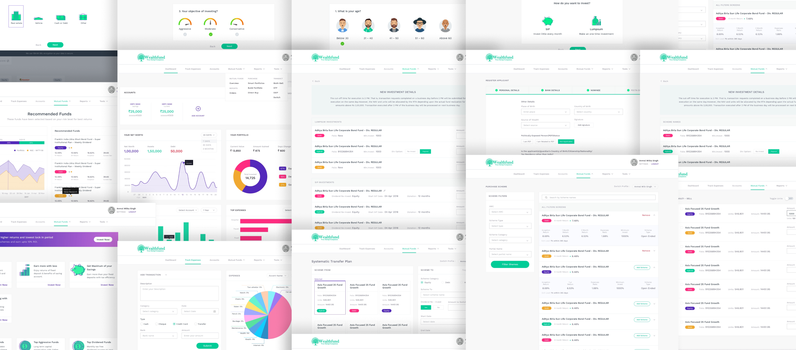
We dealt with complex content like graphs, numbers, logos, symbols by designing cards that help users digest, consume and navigate through the interface easily.
Designing for the modern, on-the-go, mobile investor.
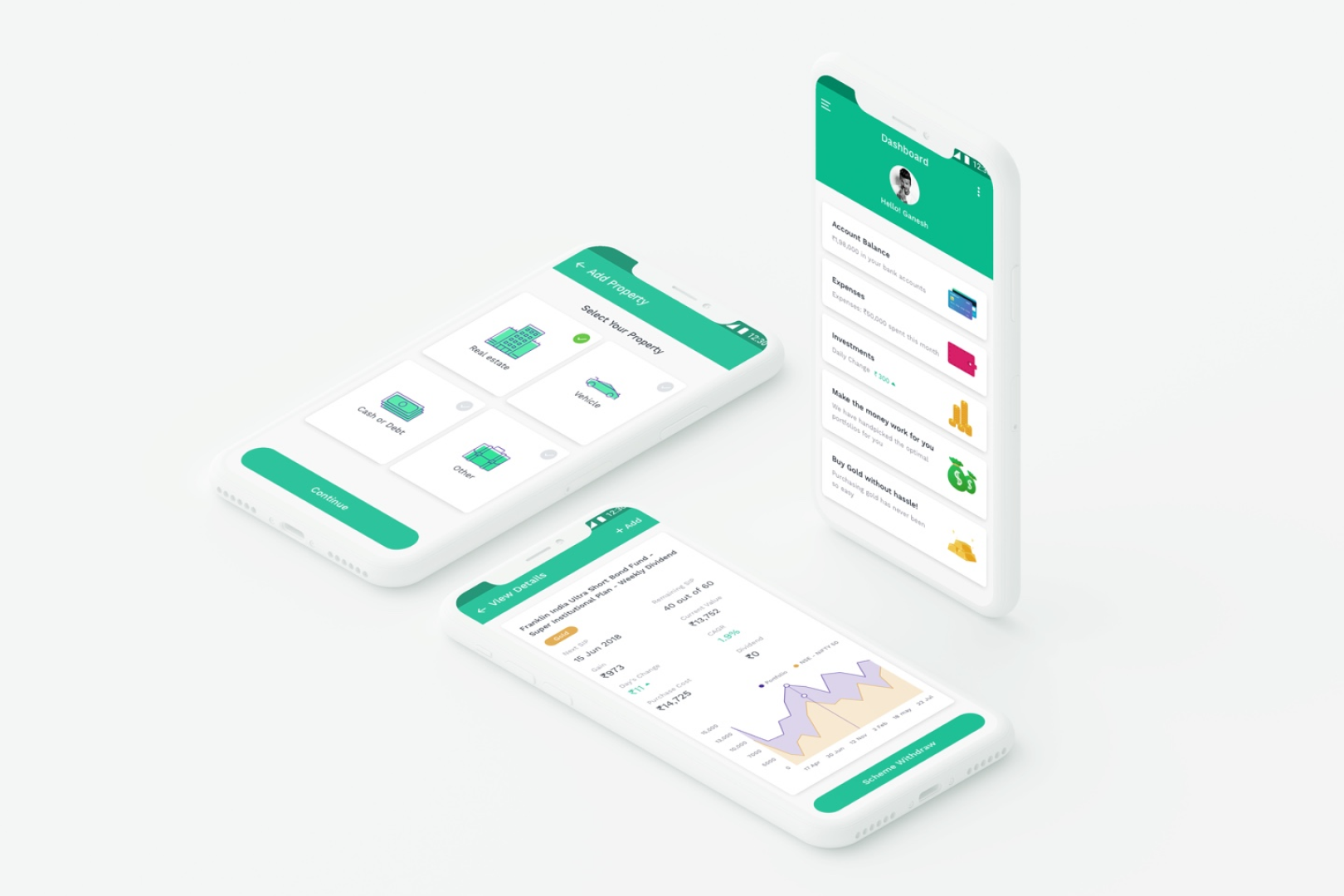
We identified and designed for a major group of mobile users who depended on the process of managing their wealth being easy and quick with feedback.
Managing personal portfolio
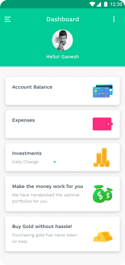
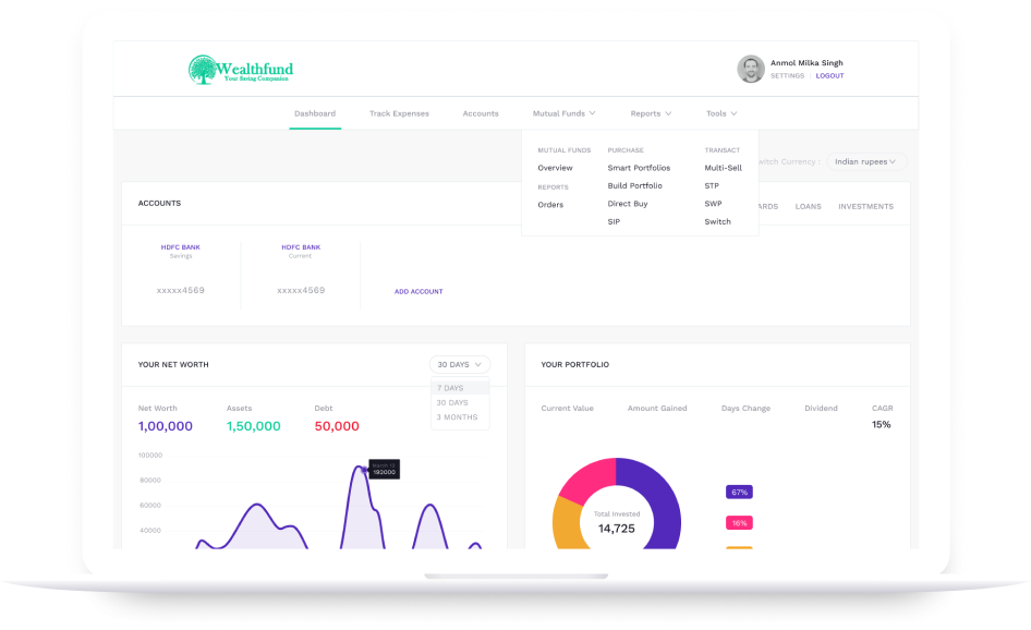
The dashboard provides at-a-glance views of personal savings, growth through mutual funds and hence personal overall net worth. Secondary actions like adding funds, making investments are made available with a single click.
Making goal-based investments
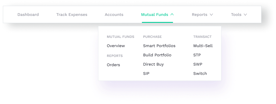
Being motivated to invest towards a particular goal, we helped the users with selecting and exploring mutual funds that will ultimately help them achieve it.

