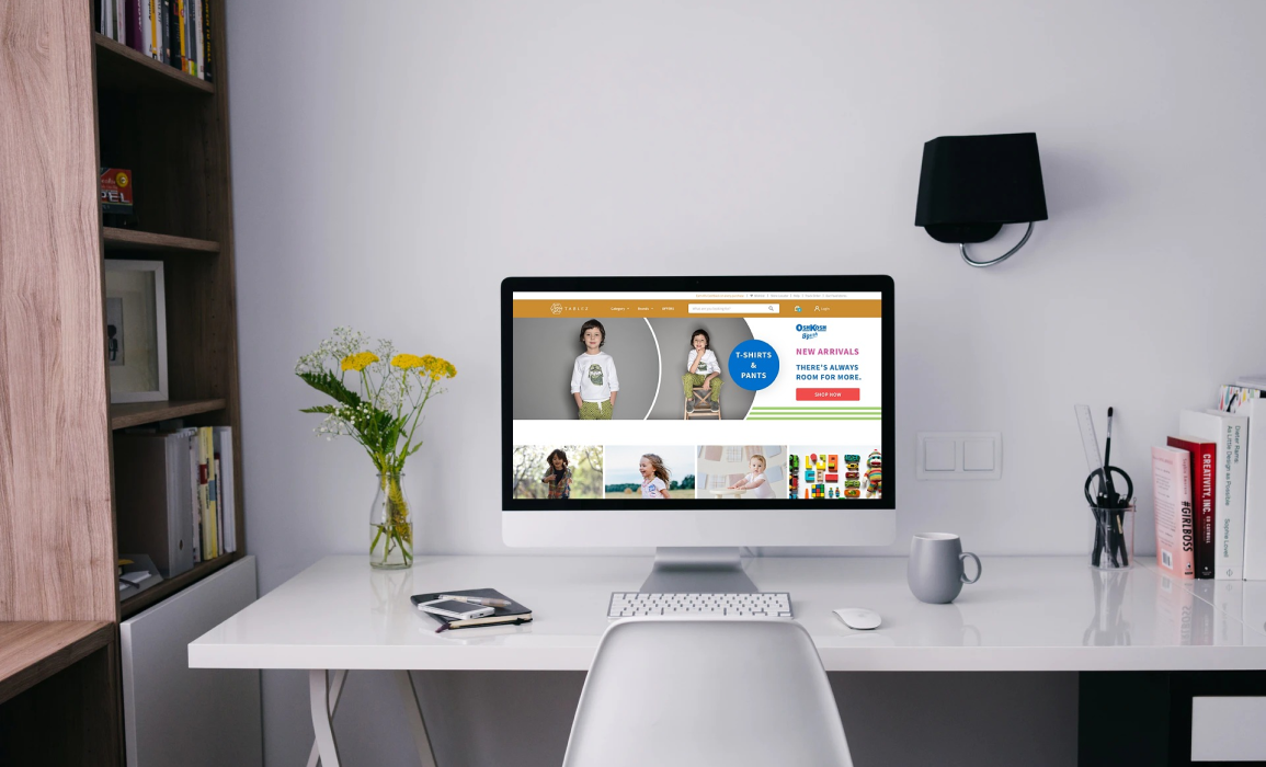
Tablez
Helping Lulu Group's retail arm, Tablez make a digital mark.
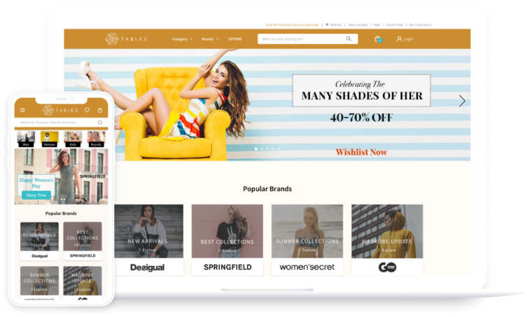
With their e-commerce platform, LuLu aimed to sell products from all their brands & partners under one integrated experience.
Industry:
E-Commerce
The vision
leading as a global retail company & inspiring lifestyles
Going beyond being just another e-commerce platform, Tablez envisioned themselves to be aggregators of various lifestyles and cultures from all around the globe. And this is what the design had to reflect and embody. A platform that elevated consumer experience.
Our role
-
Strategy
Through the initial product discovery workshop , we collaborated with LuLu’s multidisciplinary team to align ourselves with their goals.
-
UX Design
With initial research & analysis, we ideated & designed features that would add value to the users’ journey right from exploration to feedback.
-
UI Design
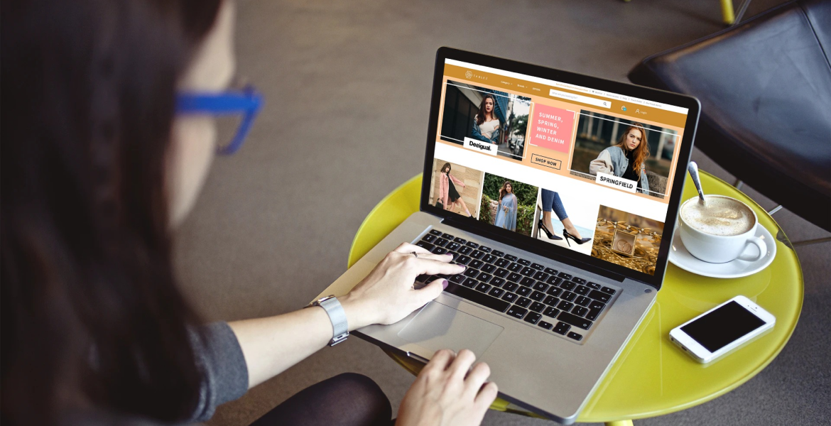
Transforming ideas into sleek, elegant interfaces that offer not only a good user experience but also a memorable brand experience.
Solution
organizing products with
information architecture.
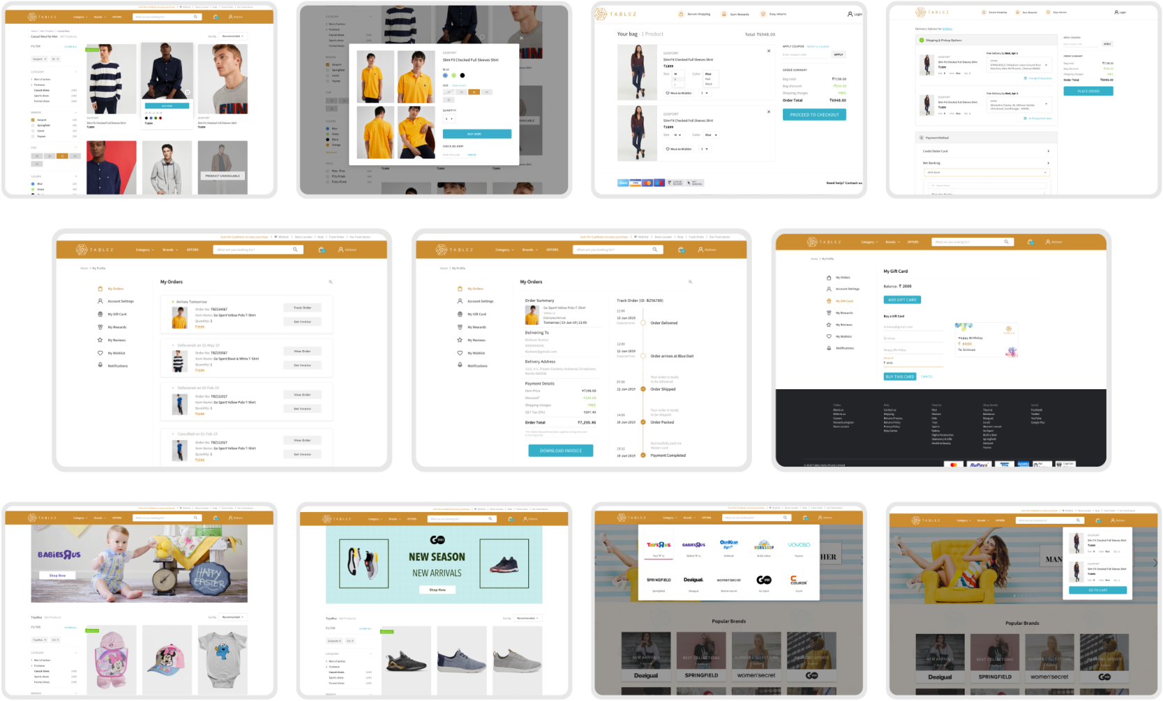
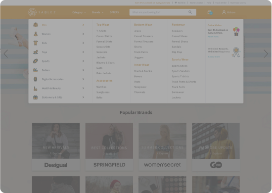
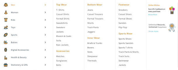
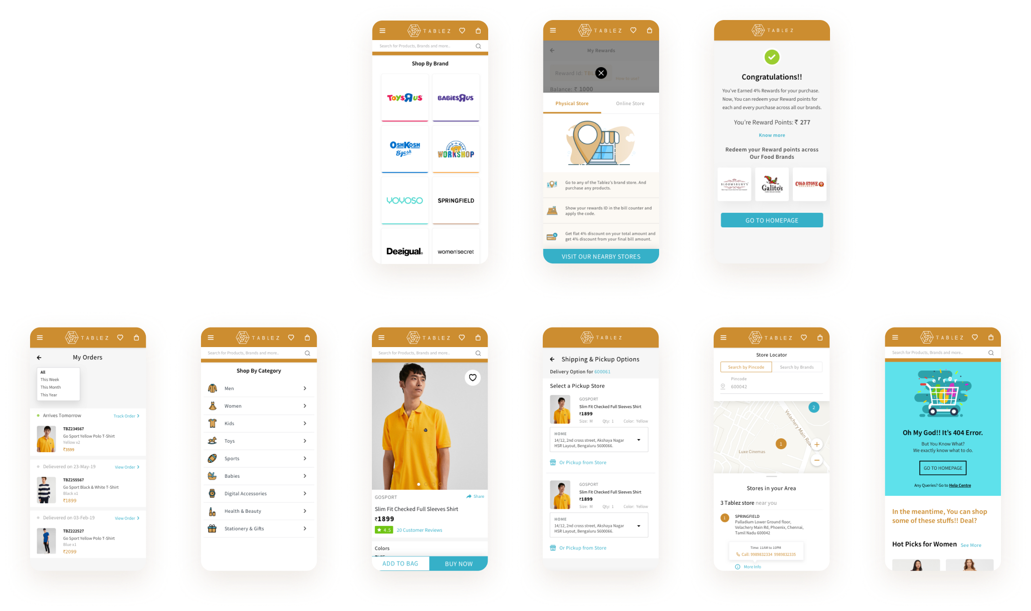
The e-commerce website that had not only varied category of products but also brands that had personalities of their own, required a strong Information Architecture. With card sorting, we were able to effectively identify the way the users perceived & grouped categories to navigate effectively.
visualizing the product
through dynamic images.
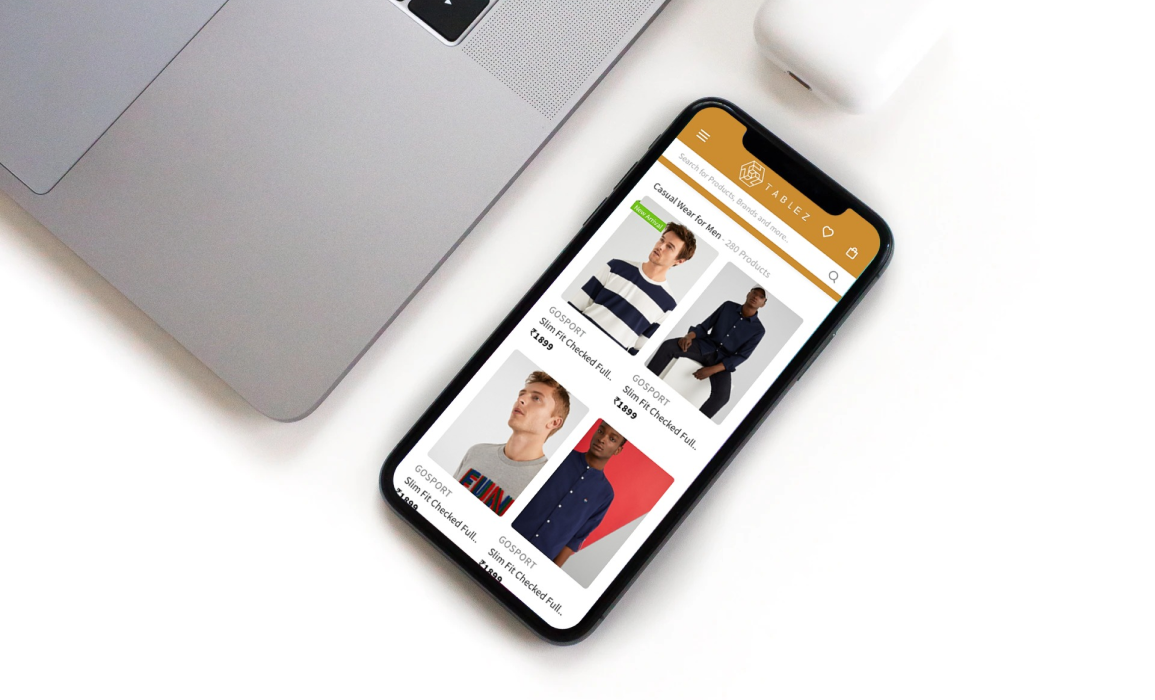
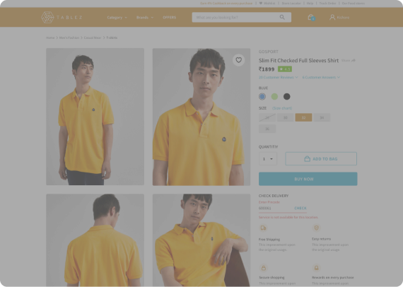
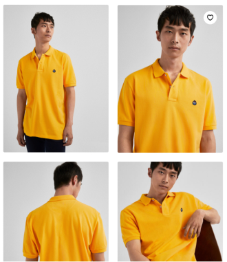
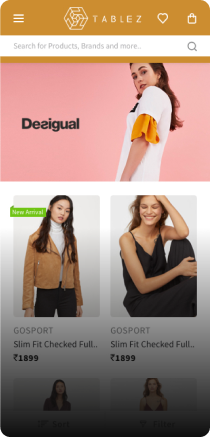
In order to get the most from the product imagery, the images were displayed in full view in contrast to using thumbnails that might possibly add fricition to the purchase process. Giving the product context, multiple angle views, zoom etc helped us add more value.
store locator for real-world connections
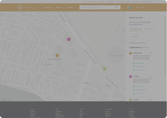
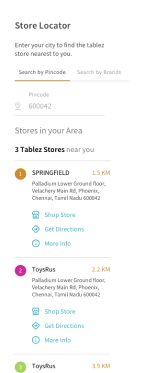
The online–offline combo being a key element in omnichannel customer journeys, we designed a store locator feature that would direct users to the physical location of stores, tackle stock unavailability, easier pickups etc.
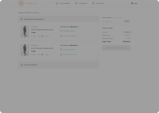
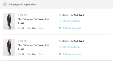
making check-out easier with only relevant choices.
Although use-cases like ‘deliver to multiple locations’, ‘deliver for single location’, ‘pick up from store’ were useful features, we looked to refining the checkout process by easier decision-making with lesser yet relevent choices.
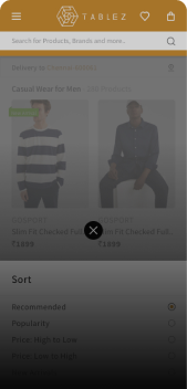
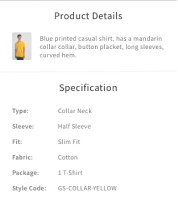
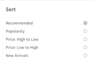
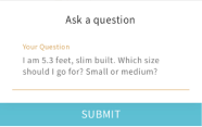
utilizing bottom sheets
for better usability.
Complementary information that helped users to know more & other prompts were designed as bottom sheets for better accessibility.

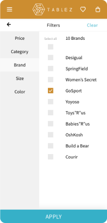
simplifying the filter to be effective and usable.
Exploring through product listing is one of the most crucial steps within a user’s journey and hence making the experience of perusing through Tablez’s diversified products simple & easy was an important goal. A filter menu that parallely allowed to search through two levels of categories was designed.
Onboarding made simple.

enabling brand
visibility at various
points.
- connecting global lifestyles & fashion through design
- rewarding users with personalized, intuitive shopping journey
- making it simpler & smoother from awareness to purchase
