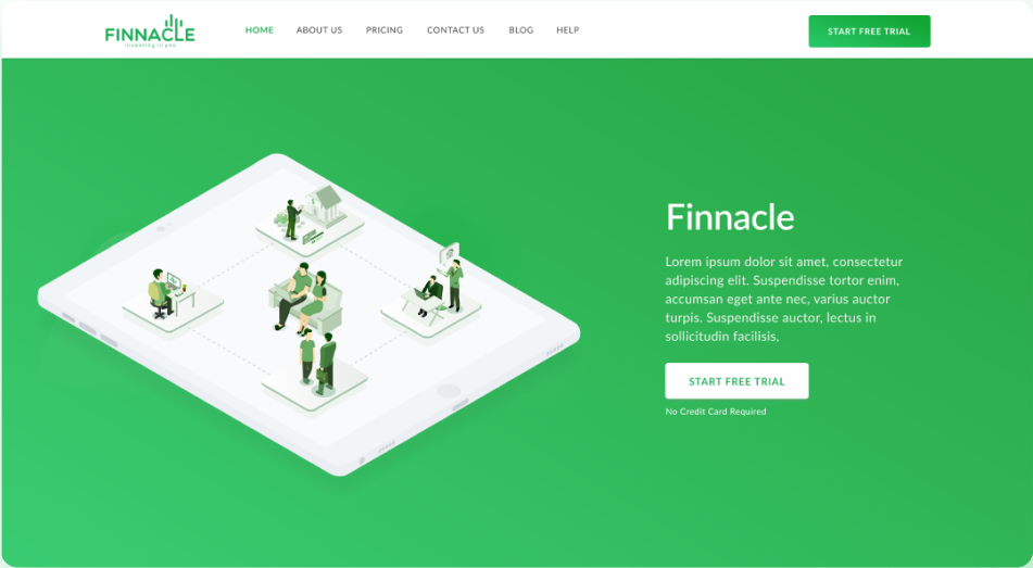
The design case study for an online platform that provides monthly personalized financial advice.
Introduction
Aimed at professionals and aspiring people, Finnacle is a solution that lies at the intersection of professional financial advice and self-built strategy by offering monthly plans to balance budgets and figure out finances.
-
Client Name
Finnacle -
Client Industry
Fin-Tech

What we did
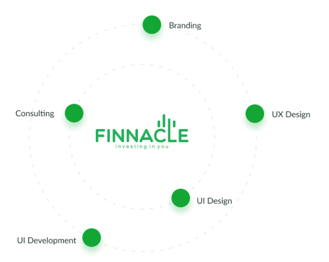
Our work for the platform expanded across a spectrum of services right from Branding across UX Strategy, UI Design and Development, all aligned to the goals of the users as well as the business.
Cards to convey
content easily
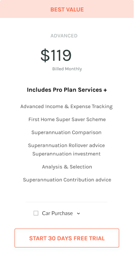
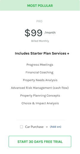
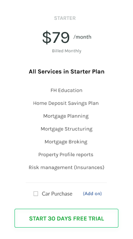
With cards, we were able to deliver complex content and actions about a single subject much more easily be it subscription models, contact details or offers that would be otherwise hard to represent.
Designing for
subscriptions
Creating the experience of choosing the subscription model to drive revenue to make it clear, open and actionable for users. By using three card designs, each with unique offers, we were able to communicate to the users, the best choice for them.
Delivering
knowledge
through blog
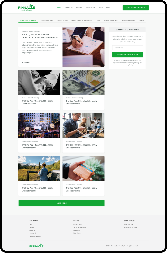
We designed the blog to not only engagege & create interest and build transparency in Finnacle’s offers but to also establish them as the thought leader in their area of expertise.
Building a consistent
visual identity
With consistent typefaces, colors illustrations/photos, shapes & the arrangement of individual elements, we looked to create strong and relatable brand identity.
