WEGoT
Identity + Website Experience for a smart water meter
company.
Website Design | 2020
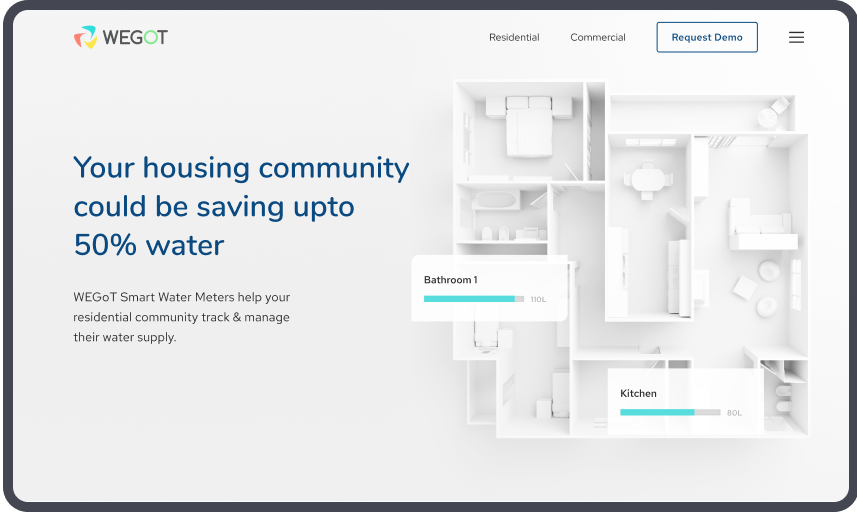
Through research & content strategy, we were able to create a plan that best suited WEGoT & its audience
The existing homepage wasn’t immediately engaging for users, and failed to quickly demonstrate what the product was and how it worked. And, by only featuring imagery of one device, a laptop, Iconosquare were missing the chance to show that their product is fully responsive and compatible with all devices.
- - Sitemap
- - Tone & Voice
- - Design
- - Development
Explaining
the product
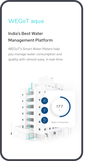
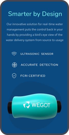
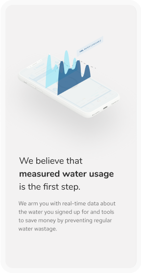
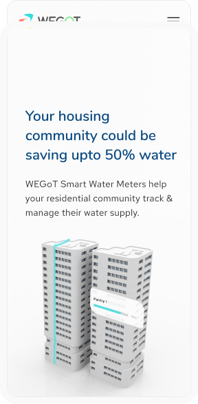
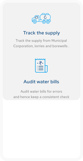
With 3-d illustrations and images , we figured out a style that not only best explains the product & its services but also appeals to potential customers.
Creating a fresh style to
motivate communities to think
smartly about water
usage.
With the website, we took sustainability as our main theme and illustrated throughout the website on how the sensor + app will allow communities to use & track consumption economically.
Buildling brand consistency
to align with WEGoT’s
guidelines.
Nunito Semibold
HEADINGRed Hat Regular
BODYDelivering to the right audience.
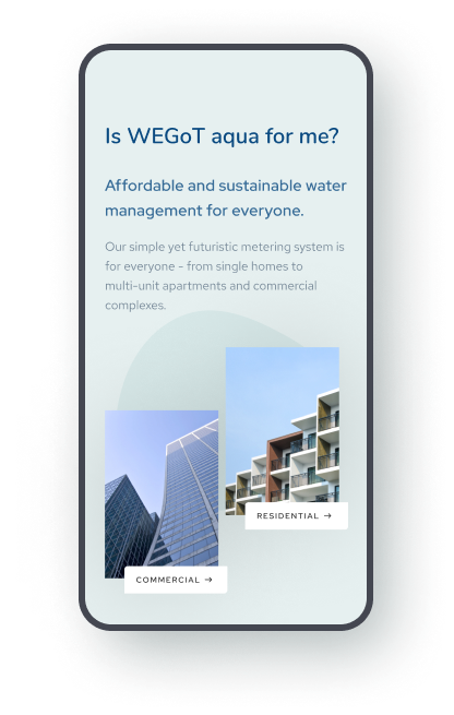
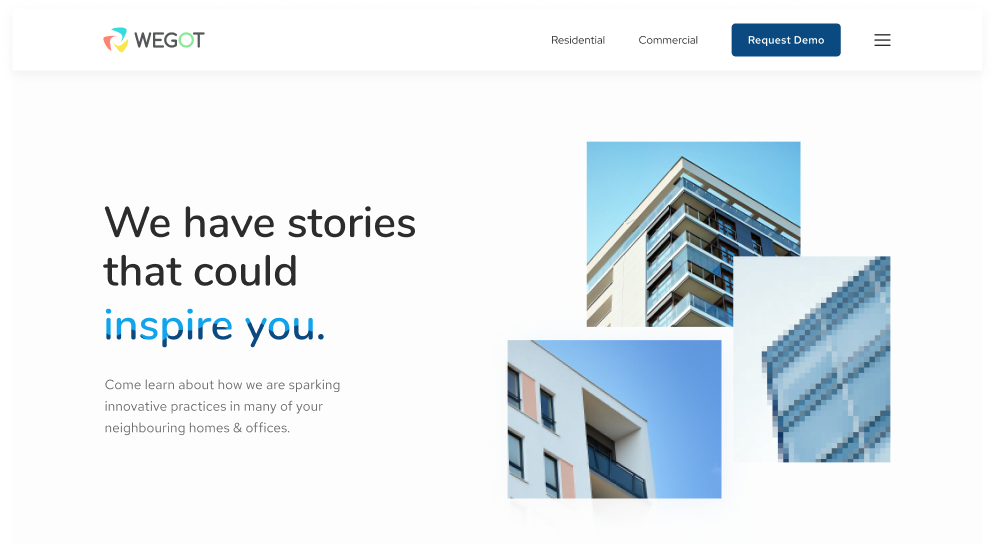
We helped WEGoT market their two types of solutions; one for residential and the other for commercial communities through the right copy and visuals.
Commercial solutions
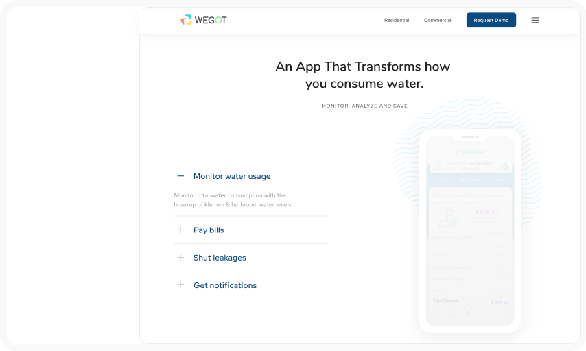
With the help of expandable tabs, we designed their commercial solutions which had customized plans for each type of building.
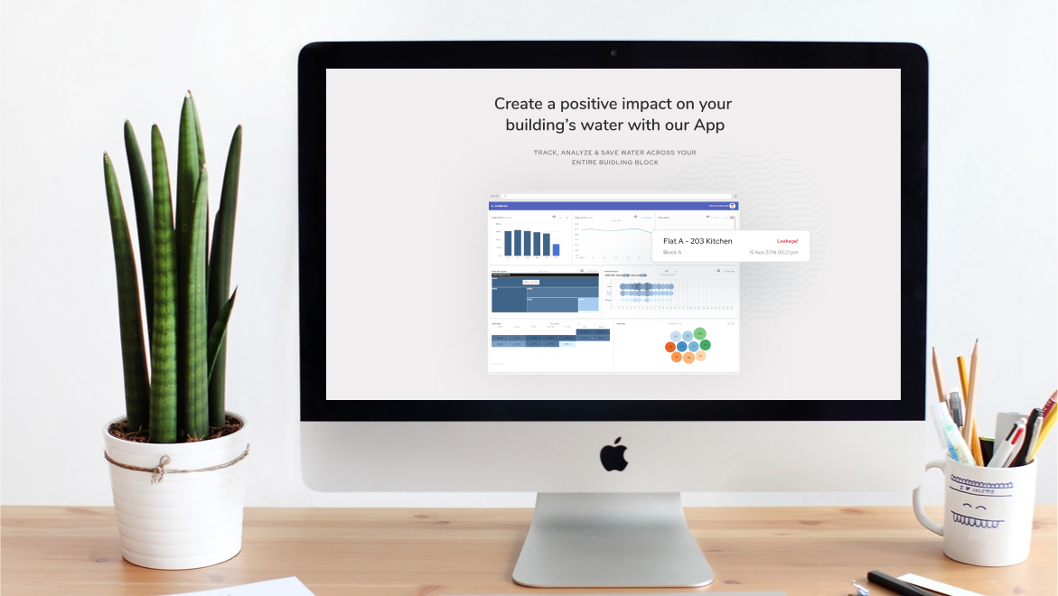
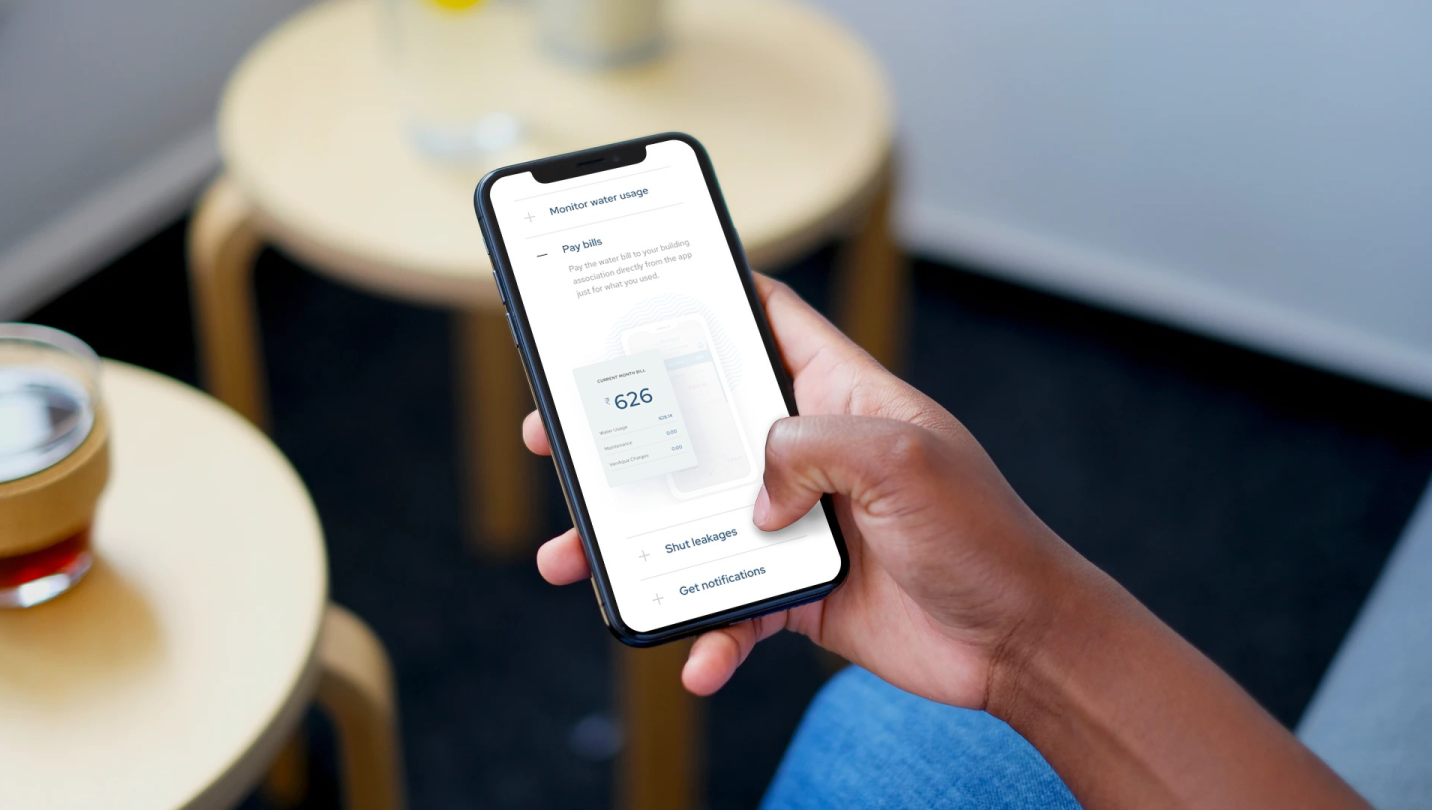
The web app dashboard helps housing admins & others with an overview of their patterns of consumption overall.
