Sodexo for a Reason
The compensation structure of
an organization is a vital motivating factor for an employee. Sodexo Meal Pass and Resto Card
are an integral part of the best compensation packages across the industries. so sodexo reach
Rillusion to design and develope a UX/UI design for their customer portal with responsive design
further our design and development team worked together to get a simplified user friendly design
to the sodexo UX/UI customer portal.
Sodexo Meal Pass and Resto Cards accepted at almost all food establishments, coffee shop, sweet
shop, canteen, juice shop, pizzeria, fast food, restaurants, bakeries, grocery shop and others.
Dribble of the UX/UI
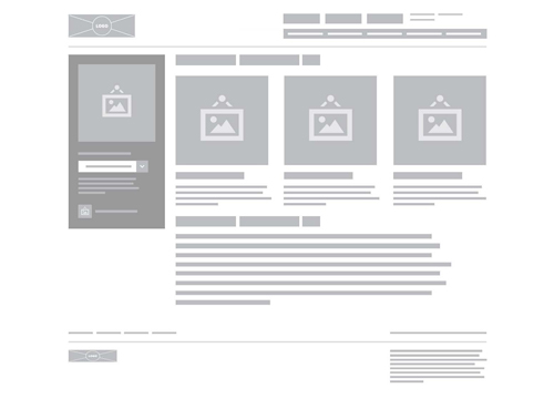
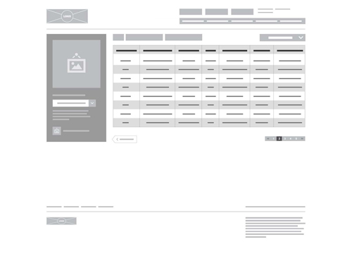
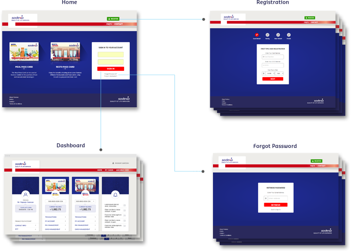
We have designed the flow of the UX/UI as much as easier to view by the visitors to get a clear idea of a UX/UI what we have conveyed.
Perfect UX/UI Design
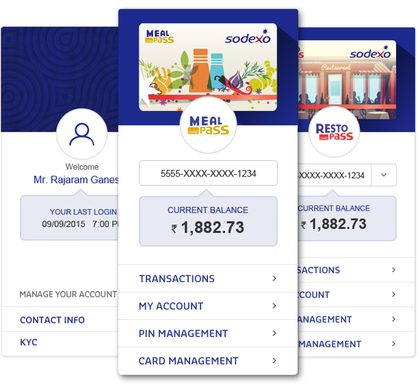
We thought to give pleasant and clean look of the UX/UI as a result, we came upon with this masterpiece.
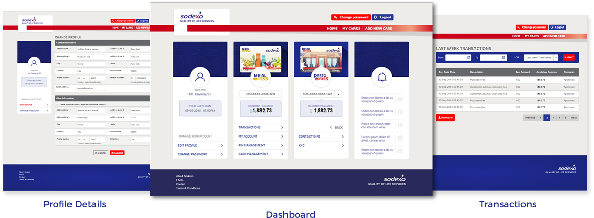
Be Clear With The Design
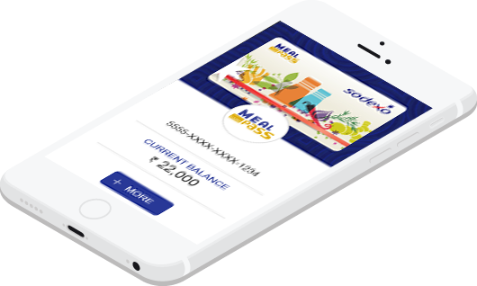
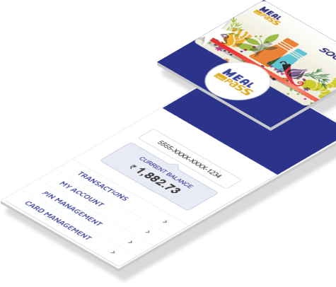
Sodexo Pass – Now in your pocket
Yeah!!!!
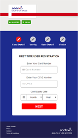
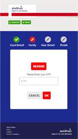
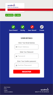
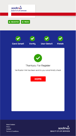
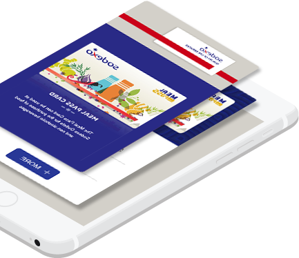
Nowadays people want's to access everything in mobile and tablet, So Responsive web design has become the default for new sites so we have decided that the exploiter should have a clear visual to all the gadgets so a responsive UX/UI design is developed to give a stress free action.
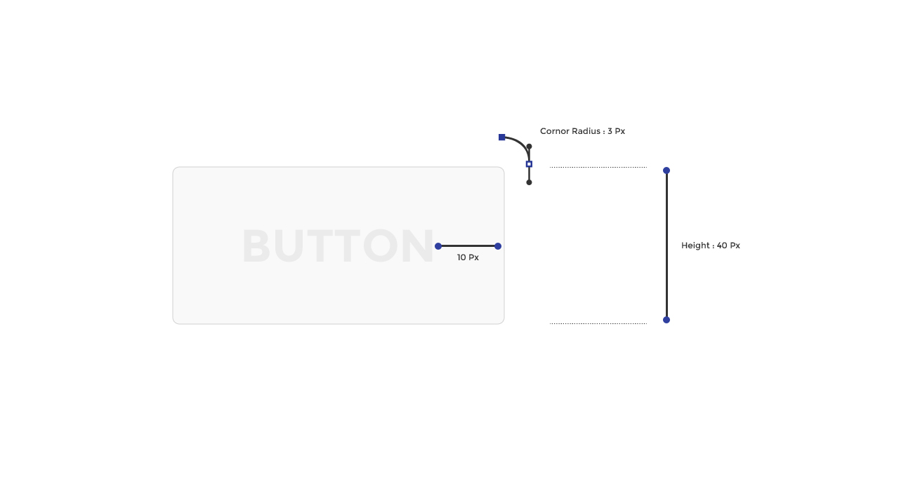
UI kit - Keys To Attraction
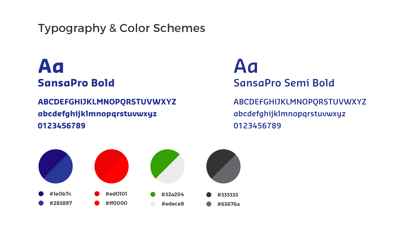
The UX/UI is more important to the users who going to get experience the visual treat. We have designed the UX/UI as colorful and attractive with user friendly to use it.

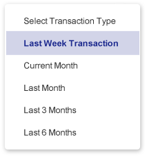
Data Filter
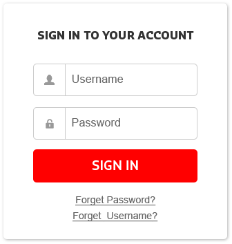
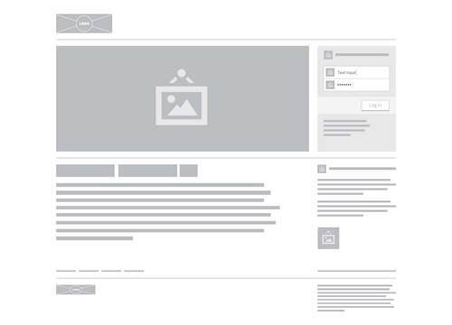
Sign in
Logout Dropdown
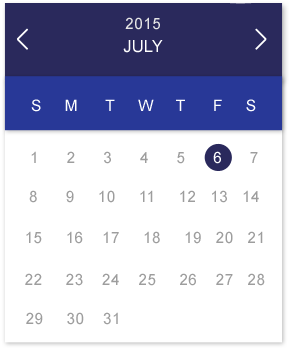
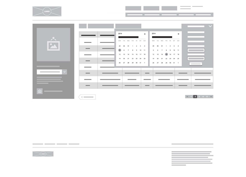
Calendar

Information Box
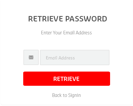
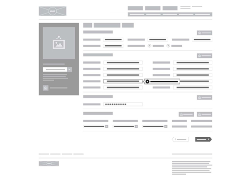
Password-Retrieval

Pagination
Mobile UX/UI
Statistics
Here you can see our designers work for this UX/UI
no.of lines, hours of work and pixels
crafts taken to develop the website.
lines of coding 320Hrs
Hours of work 64K
Pixels
